As someone who has done a lot of house viewings over the past couple of years, I can tell you there is a fine line to tread when it comes to interiors. On the one hand, I was always drawn to houses that looked fresh and modern - décor trends done tastefully were a sure-fire way to make me covet a house. On the other hand, being too whacky or over-the-top in following trends was a big no-no - I remember certain properties covered in neon signs and garish wall colours, which while obviously not deal-breakers, didn't give me a great first impression of the rooms.
Paint colours can make or break how appealing your home is to potential buyers.
Michael Rolland, MD and paint expert at The Paint Shed, agrees that being on-trend but not slavishly following interiors fads is the key to creating an appealing, sellable property. 'Following decorating trends is a great way to add value to your home especially when it comes to trends with longevity. Colour choices like pistachio green or subtle pops of red are good examples. These can enhance a property's appeal by helping potential buyers imagine themselves in a space that feels high-quality and thoughtfully styled, rather than focusing on DIY projects that still need to be done,' he says.
'The one caveat to following trends is that they can go in and out of fashion, and more unique or bold trends may not appeal to everyone, which could limit a property's long-term resale potential. The key to avoiding this is to spot a micro-trend.' But how do you identify one?
'Micro-trends become popular very suddenly, and they can disappear just as quickly,' he says. 'Micro-trends also tend to be more 'out there' in terms of designs. Striped walls have been used more and more in the past year, but if you're wanting to sell your home in five years' time, be aware that they may not be so trendy anymore. Other trends however, such as colour drenching [where a single colour, or closely related tones, are applied across all surfaces in a room] can make your home stand out. Returning styles also have better longevity, so don't be afraid of incorporating more vintage designs from the 70s and 80s.'
As for current trends that will stand the test of time, Rolland recommends cool blue as the one to go for. Trend experts at Pinterest have named "a pop of cool blue" one of the hottest interior design trends for 2026, and according to research from The Paint Shed, UK Google searches for "blue paint colour codes" have surged by 1,600% in the past 12 months. Meanwhile, the term "cool blue paint" saw over 38,500 searches last month alone.
'Cool blue is calm, delicate, and has that Bridgerton-era softness homeowners are craving,' says Rolland. 'With a rich history in the design world, it also offers a kind of timeless neutrality that works beautifully in almost any space.
This soft, nuanced colour is one of the most versatile for homeowners and designers. 'Blue can feel calming, fresh, and effortlessly balance both masculine and feminine vibes. It works just as well in a country cottage as it does in a London townhouse. It's truly a one-size-fits-all colour,' says Rolland.
Here's how to pair it with other colours:
Brown
'Cool blue and warm brown is a good place to start, and the beauty of this combination is how it balances opposites. Brown brings warmth and comfort and cool blue brings an icier, fresher touch. Together, they create a king of natural harmony in the home - a yin and yang.'
Try:
Farrow & Ball's Kittiwake with Broccoli Brown
Orange
'Orange is blue's sister colour on the colour wheel - that means pairing the two creates maximum contrast. However, this doesn't have to be a shock to the senses. Try mustard-orange tones, terracottas, or soft burnt oranges against cool blues which let the blue sit back and do all the foundational work.'
Try:
Benjamin Moore's Blue Dusk with Cinnamon
Red
'Red is the unexpected 'pop' that just keeps coming back, and it works perfectly with cool blue. It's the balance of fire and water. Think cool blue walls with cherry-red trim, or a blue base accented with red lamps or headboards. This combination makes a simple, eye-catching contrast that feels playful and elegant.'
Try:
Little Greene's Bone China with Atomic Red
Expert warning: don't over-do the 'cool'
Cool blue is fresh and elegant, but getting it right is all about balance. Ignoring its undertones can lead to clashing shades.
Rolland advises: 'Pay attention to undertones when layering blues or pairing them with other colours. It keeps the palette cohesive and prevents any unintended clashes. A good rule of thumb is to pair warm undertones against cool - this is an interior designer's secret that takes children's classroom blue to high-end London townhouse blue.
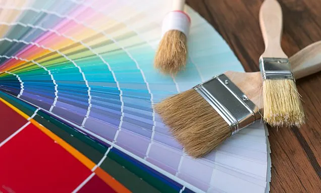
'Be sure to swatch a range of blues in store. Shades look different under different lighting and you want to make sure your colour works within your plan.'